
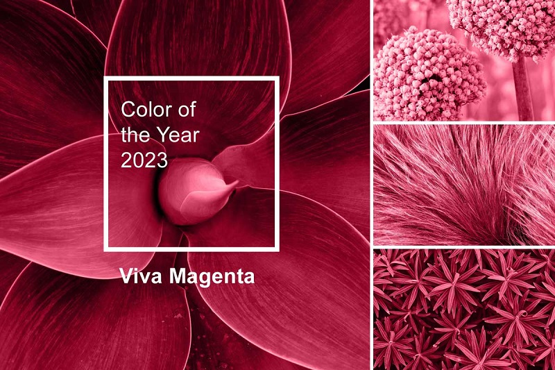
Viva Magenta: Using Pantone’s 2024 Color of the Year in Your Designs
Looking to stay on-trend with your design work? Pantone’s 2024 Color of the Year is Magenta, and we’ve got all the ideas you need to make it work for you.
In 2024, colors will continue to play a major role in setting the tone and themes of many industries. The year 2023 was all about empowerment — an indication that this would be reflected in the dominating color trend for 2024. After years without any red shades included among its top hues, a passionate yet powerful reddish tint claimed victory as being one of the most distinguished colors for this upcoming year.
Introducing Pantone’s 2024 Color of the Year – Magenta!
Pantone, the global authority on color, has announced magenta as the 2023 Color of the Year. The stunning shade, also known as Viva Magenta, is a bold and vibrant hue that evokes energy, passion, and creativity. The announcement of the Pantone Color of the Year is eagerly awaited each year by designers, marketers, and fashionistas alike; it sets the tone for color trends and inspires creativity across different industries.
The selection of magenta as the 2024 Color of the Year is a bold move by Pantone, as it represents a departure from the muted and earthy tones that have dominated recent years. This vibrant shade is sure to make an impact in the worlds of graphic design, fashion, and interior design. It can add a pop of color to a neutral color scheme or be paired with other bold hues to create a striking and eye-catching palette.
For t-shirt makers and logo makers, incorporating magenta into their designs will be a great way to stay on trend and create designs that resonate with customers. Whether used as a primary color or as an accent, magenta is sure to make a statement and help designs stand out in a crowded marketplace.
In addition to its visual appeal, magenta is a color with significant symbolic meaning. It represents strength, courage, and a willingness to stand out from the crowd. By incorporating this bold shade into their designs, creators can tap into these powerful associations. This will help in creating designs that communicate a sense of confidence and individuality.
Pantone Color of the Year 2024
Overall, the selection of magenta as the Pantone Color of the Year 2024 is an exciting development for designers. Its bold and energetic personality has inspired creativity and created a sense of excitement in the design community. So let’s embrace Viva Magenta and see where its vibrant energy takes us!
Here are some relevant statistics and fun facts about Pantone’s 2024 Color of the Year, Magenta:
- Pantone has been announcing the Color of the Year since 2000, and it has become a highly anticipated event in the design world.
- Magenta is a highly versatile color that is used in a wide range of designs, from bold and vibrant to subtle and understated.
- Magenta is a popular color in the fashion industry and has been used in runway shows by designers such as Gucci, Chanel, and Prada.
- According to a survey conducted by Pantone, 77% of designers use the Color of the Year in their work, and 58% of consumers say they are more likely to buy a product in the Color of the Year.
- In color psychology, magenta represents creativity, individuality, and passion, making it a good choice for designers who want to create bold and impactful designs.
- Magenta is a color often associated with technology, and it is used in the branding of many tech companies, including Twitter, PayPal, and LG.
- Magenta is a popular color for weddings. It is used in floral arrangements and bridesmaid dresses.
- In the printing industry, magenta is one of the four primary colors used in the CMYK color model, used in creating a wide range of colors in printed materials.
- Pantone’s Color of the Year is not just a trend; it can significantly impact the design industry, with many designers and companies using the color as a reference point for their work throughout the year.
- Pantone’s selection of magenta as the Color of the Year 2024 is sure to inspire a wide range of designs, from t-shirts and logos to interior design and branding.
![]()
How to Incorporate Magenta into Your Logo Design
Incorporating Pantone’s 2024 Color of the Year, Magenta, into your logo design can add a bold and eye-catching element that will help your brand stand out. Here are some tips on how to incorporate magenta into your logo design:
- Make magenta the focal point. To make it the center of your brand, use it as the dominant color in your logo design. Use it for text or iconography to make a strong visual impact.
- Pair magenta with neutral colors: Balance its boldness by pairing it with neutral colors like black, white, or gray. It creates a more sophisticated look and prevents the design from being overwhelming.
- Combine magenta with complementary colors: magenta pairs well with colors opposite on the color wheel, such as green or yellow. Using complementary colors in your logo design creates a harmonious and visually pleasing design.
- Use magenta as an accent color. Incorporating magenta as an accent color can add a pop of color to your logo design. Use it for small details such as borders or text highlights, or incorporate it into the logo mark.
- Experiment with different magenta shades. Magenta has several shades, from deep and rich to light and airy. Experimenting with different shades helps you find the perfect tone that fits your brand’s personality and message.
- Consider your target audience: When incorporating magenta into your logo design, think about your audience and how they perceive the color. Magenta is associated with creativity, energy, and youthfulness, making it a good fit for brands targeting younger or more dynamic audiences.
Overall, incorporating magenta into your logo design can add a bold and energetic element to your brand identity. By experimenting with different shades and combinations of colors. You can create a design that is both visually appealing and effective at communicating your brand message.

Using Magenta in Your Brand Packaging and Display Graphics
Magenta is a bold and vibrant color that can be an effective choice for brand packaging and display graphics. Here are some tips for using magenta in your branding:
- Consider your target audience. Magenta may be a great choice for brands targeting a younger, more vibrant demographic. If your audience is more mature, you may want to consider a more subdued color palette.
- Use magenta as an accent color. Magenta can be overwhelming if used excessively, so it’s best to use it as an accent color. For example, you could use magenta to highlight important information on your packaging or as a background color for your display graphics.
- Pair magenta with complementary colors: Magenta pairs well with complementary colors such as green, yellow, and blue. Experiment with different color combinations to find what works best for your brand.
- Choose the right shade of magenta. There are many shades of magenta, from hot pink to deep burgundy. Choose a shade that fits with your brand’s personality and values.
- Be consistent: Once you’ve chosen a magenta shade and complementary colors, be consistent in your use of them across all of your branding materials. This will help to build brand recognition and create a cohesive visual identity.
In summary, magenta can be a powerful color choice for brand packaging and display graphics. Moreover, it’s important to use it strategically and in a way that complements your brand’s overall visual identity.
Spicing Up Your Website with Magenta Accents
Using magenta accents on a website can be a great way to add a pop of color and create visual interest. Magenta is a bold and vibrant color that can catch the eye and make your website stand out.
Here are some tips for incorporating magenta accents into your website design:
- Select the right magenta shade: magenta offers various shades, from faint to intense. Select a magenta shade that complements your website’s tone and mood.
- Moderate your use of magenta. Though magenta can add visual interest, overuse can be overwhelming. Use magenta as an accent color, not a primary one, and deploy it strategically to highlight crucial website elements.
- Coordinate magenta with complementary colors: Magenta coordinates with a variety of colors, such as gray, white, black, and various blues and greens. Experiment with different color combinations to find the ones that suit your website best.
- Consider the context: Magenta accents may or may not be suitable, depending on your website’s context. For instance, a magenta accent could work well on a fashion or beauty website but may not be as effective on a financial or legal website.
- Test and refine: As with any design aspect, testing various magenta accents is vital to see how they resonate with your audience. Collect feedback and refine your design until you achieve the ideal balance of magenta and other colors for your website.

What is Magenta?
Magenta is a machine-learning platform developed by Google that is designed to help creators produce music, art, and other forms of digital content. It can be a valuable tool for digital content creation and social media posts.
Here are some ways you can utilize Magenta in your digital content creation and social media posts:
- Generate music: Magenta’s AI algorithms can create music, from simple melodies to complex compositions. You can use this music in your videos or as background music for social media posts.
- Create art: Magenta can generate images and videos, from simple sketches to complex paintings. You can use these visuals to create eye-catching social media posts or to enhance your website.
- Enhance videos: Magenta can analyze videos and automatically generate soundtracks that match the mood and tempo of the video. It can save you time and effort when finding the right music for your video.
- Improve audio quality: Magenta can enhance audio recordings by removing noise and improving clarity. It can be useful for podcasts and other audio content.
- Create chatbots: Magenta can be used to create chatbots that can interact with users on social media platforms. It can help you engage with your followers and provide them with personalized experiences.
- Generate captions: Magenta can generate captions for your videos and images, making them more accessible to a wider audience.
Magenta can help you create more engaging and high-quality content for your social media channels. It’s a powerful tool that can save you time and effort while improving the quality of your content.

The Power of Color Psychology and What It Can Do for Your Brand Image
Color in branding and marketing is not merely aesthetic; it significantly influences brand perception and even buying decisions. This is where color psychology comes into play, as it explores how color impacts human emotions and behavior. Utilizing color psychology can aid in developing a potent and successful brand image.
Here are some ways in which color psychology can help enhance your brand image:
- Creating brand recognition: The consistent use of color or a combination of colors in your branding efforts can help create a strong visual identity. For example, when you see the colors red and yellow together, you immediately think of McDonald’s. This kind of association creates brand recognition, making it easier for customers to remember and identify your brand.
- Communicating brand personality: The use of color can communicate your brand’s personality and values. For instance, green is often associated with nature, health, and sustainability, making it a popular choice for eco-friendly brands. On the other hand, black is often associated with luxury, sophistication, and elegance, making it a popular choice for high-end brands.
- Evoking emotions: Different colors can evoke different emotions in people. For example, red is often associated with excitement, passion, and urgency, while blue is associated with trust, reliability, and calmness. Using these colors strategically in your branding can help you communicate the desired emotions to your target audience and influence their behavior.
- Creating contrast and hierarchy: The use of color can create contrast and hierarchy in your branding efforts, making it easier for customers to understand and navigate your messaging. For example, using a bright color on a call-to-action button can make it stand out and encourage customers to click.
- Enhancing brand perception: The use of certain colors can enhance customers’ perceptions of your brand. For instance, you can use warm colors like orange and yellow. This can create a sense of friendliness and warmth, making your brand more approachable.
Incorporating color psychology into your branding and marketing efforts can help you create a strong brand image and connect with your target audience. Here are some tips for using color psychology effectively:
- Research your audience: colors may have different meanings and associations depending on culture and context. Thus, researching your audience is essential to understanding their cultural and personal color associations.
- Use color consistently: Consistent color used in branding can establish a robust visual identity and increase brand recognition.
- Select colors that match your brand’s personality and values. Colors should align with your brand’s personality and values to create an authentic and unified brand image.
- Experiment and test: Test different colors and combinations without hesitation to find the most effective options for your brand. Conducting A/B testing can aid in determining the colors that best achieve your branding objectives.
In conclusion, color psychology can be a powerful tool for creating an effective brand image. By understanding the impact of color on human behavior and emotions. You can use it to communicate your brand’s personality, evoke emotions, and enhance brand recognition.
Short Bio:
Jenn Pereira, a Content Strategist at Kittl.com, has vast experience in comprehending user experience and developing effective approaches to creating content that fulfills users’ needs and expectations. Kittl is an intuitive design platform that offers several tools, including an AI image and logo generator, a t-shirt maker, and more.